
Why Refreshing a Peptide Brand Matters
The peptide market is exploding. In the past three years, global sales have surged past $10 billion, and new entrants multiply weekly. This rapid expansion creates a crowded shelf‑space where clinicians, research subjects, and investors scan dozens of labels before deciding which product to trust.
Visual consistency builds trust
For health‑focused audiences, a familiar visual language is more than aesthetic—it’s a shortcut to credibility. Clinicians rely on recognizable packaging to verify purity, research subjects look for the same color palette to confirm they’re receiving the right formulation, and regulatory bodies check that labeling remains compliant across product generations. When a brand’s visual DNA stays intact, every stakeholder instantly knows “this is the product we’ve vetted before.”
Data‑backed impact of recognizable cues
A 2024 Nielsen brand‑recall study found that brands that preserve core visual elements enjoy a 15 % lift in purchase intent compared with those that overhaul their look completely. The study tracked 2,500 health‑care professionals across three market segments and concluded that “visual continuity directly correlates with perceived reliability.” Read the full report.
Risks of a poorly executed redesign
Changing a logo, color scheme, or packaging without a strategic plan can erode brand equity built over years. Customers may mistake the new design for a different supplier, leading to confusion and lost sales. Moreover, abrupt visual shifts can trigger compliance red flags—regulators may question whether the product still meets FDA labeling standards, especially for Research Use Only (RUO) peptides where documentation is critical.
The sweet spot: refresh without losing DNA
The ideal approach is a “soft refresh.” Update typography, introduce modern graphics, or refine packaging ergonomics while keeping the signature hue, emblem, or layout that makes your brand instantly identifiable. This balanced strategy signals evolution and relevance without sacrificing the trust that clinicians and research subjects already associate with your name.

Audit Your Existing Visual DNA
Before you can refresh a peptide brand, you must first understand the visual elements that already earn trust, meet regulatory standards, and differentiate your business in a crowded market. A systematic audit creates a factual baseline, ensuring that any redesign preserves the core DNA that clinicians, lab technicians, and research subjects already recognize. Below is a step‑by‑step checklist that walks you through every critical touchpoint, from logo geometry to the subtle graphic motifs that appear on label backs.
1. List the Core Visual Components
- Logo shape – the geometric silhouette, iconography, and any unique negative‑space treatment.
- Primary color palette – the exact HEX or Pantone values used across digital and print media.
- Signature typography – the headline and body fonts, including weight, kerning, and line‑height specifications.
- Recurring graphic motifs – patterns, icons, or scientific illustrations that appear on packaging, brochures, or website hero sections.
Document each component in a simple spreadsheet, noting version numbers, usage guidelines, and the last date of visual compliance review. This inventory becomes the reference point for every subsequent evaluation.
2. Conduct a Brand Asset Inventory
Gather every brand artifact—print flyers, clinic signage, website screenshots, e‑commerce product pages, label templates, and shipping boxes. For each asset, map the visual component(s) to a specific business function:
- Regulatory communication – assets that convey compliance statements or R‑U‑O labeling.
- Sales enablement – brochures, slide decks, and digital ads that drive conversions.
- Operational touchpoints – packaging, invoices, and internal SOP documents.
- Brand advocacy – social‑media graphics and testimonial cards used by clinic owners.
Assign a column for “Frequency of Use” (daily, weekly, quarterly) and a column for “Stakeholder relevance” (high, medium, low). This matrix highlights which visuals are mission‑critical and which are peripheral.
3. Use Stakeholder Interviews to Gauge Trust
Schedule short, structured interviews with three key groups:
- Clinic owners – ask which logo or color instantly signals credibility when they recommend a product to research subjects.
- Lab technicians – discover which label layouts reduce handling errors and reinforce compliance.
- Marketing staff – identify which typography and graphic motifs generate the highest click‑through rates on email campaigns.
Record qualitative feedback on a “trust scale” (1‑5) and note any recurring phrases such as “clean,” “professional,” or “clinical.” These insights will directly inform the scoring system in the DNA matrix.
4. Create a “DNA Matrix” to Score Each Element
The DNA matrix quantifies three dimensions that matter most to peptide brands:
- Recognizability – how quickly the element is associated with YourPeptideBrand.
- Regulatory relevance – whether the visual complies with FDA R‑U‑O labeling guidelines.
- Emotional impact – the degree to which the element evokes trust, safety, and scientific credibility.
Score each element on a 1‑10 scale for each dimension, then calculate an average “DNA score.” Elements with scores above 8 are strong candidates to remain unchanged; those below 5 may need retirement or subtle refinement.
| Element | Recognizability (1‑10) | Regulatory Relevance (1‑10) | Emotional Impact (1‑10) | Average DNA Score |
|---|---|---|---|---|
| Logo shape | 9 | 8 | 9 | 8.7 |
| Primary teal‑blue palette | 7 | 9 | 6 | 7.3 |
| Sans‑serif headline font | 6 | 8 | 7 | 7.0 |
| Hexagonal molecule motif | 5 | 7 | 5 | 5.7 |
5. Identify Low‑Performing Assets for Retirement or Tweaking
Review the DNA matrix alongside the asset inventory. Any element with an average score below 6, especially if it appears on low‑frequency assets, should be flagged. Consider the following actions:
- Retire – remove outdated icons or color shades that no longer align with regulatory language.
- Subtle tweak – adjust line weight on the logo or fine‑tune hue saturation to improve accessibility without breaking brand recall.
- Replace – swap a generic stock illustration with a custom, science‑backed graphic that reinforces peptide expertise.
Document each decision, assign a responsible team member, and set a realistic timeline (e.g., “Update label template by Q3”). This disciplined approach guarantees that the refreshed visual system retains the DNA that clinicians trust while shedding elements that dilute brand potency.
Redesign Packaging Without Losing Identity
FDA RUO Labeling Essentials
The FDA mandates that every Research Use Only (RUO) peptide container display a clear “For Research Use Only” statement, the appropriate RUO icon, and any required hazard warnings. These elements are non‑negotiable because they protect end‑users and keep your brand out of regulatory trouble. A quick audit of the FDA RUO guidance will reveal the exact font size, placement, and color contrast required for each mandatory element.
Side‑by‑Side Mock‑up
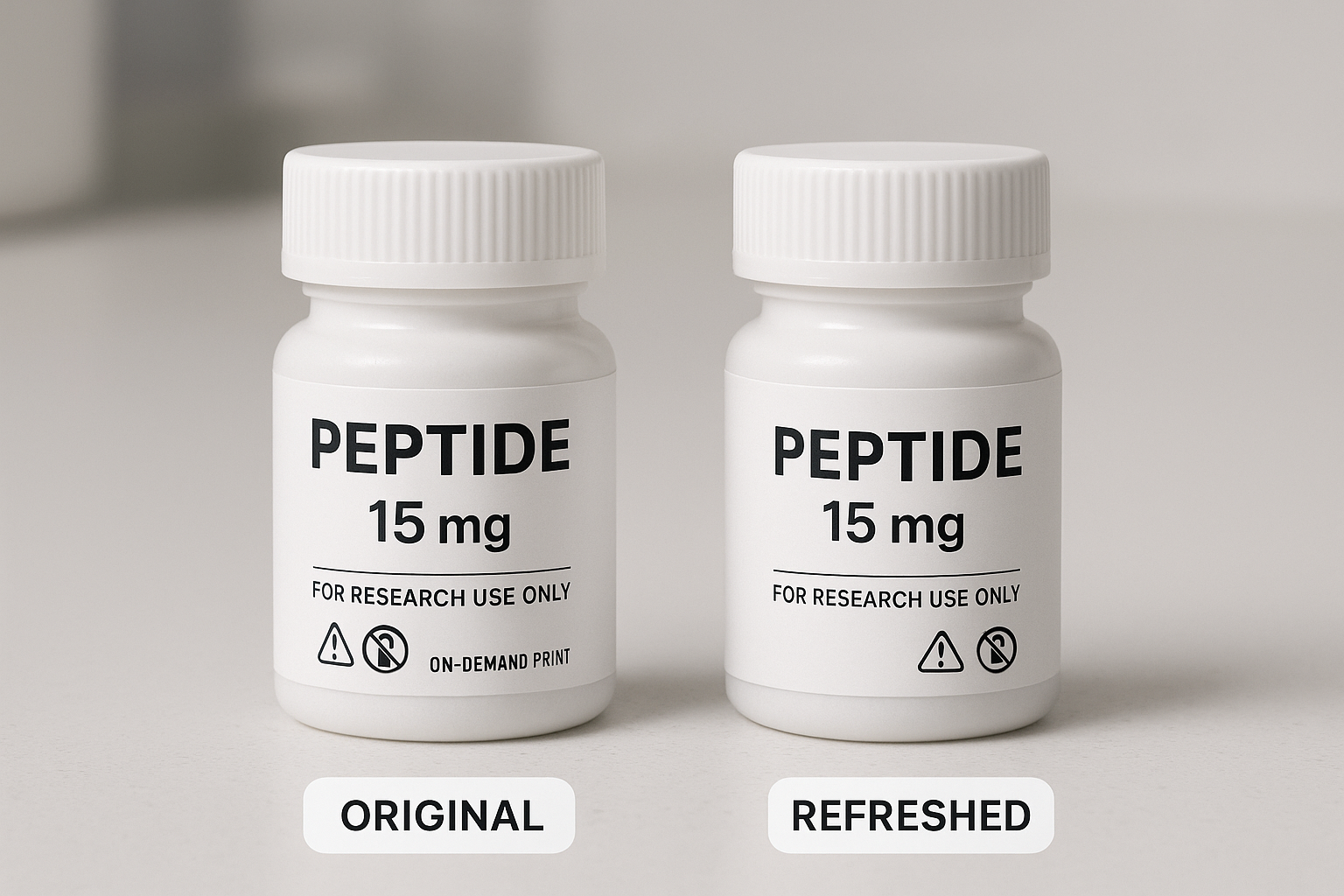
Visual comparison is the fastest way to gauge whether a redesign respects the original visual DNA. Place the current label on the left and the refreshed concept on the right within a single <figure> element. This layout lets stakeholders spot subtle shifts in logo placement, color accents, or iconography before any ink hits the printer.
Step‑by‑Step Redesign Process
- Preserve logo placement and accent color. Keep the logo exactly where clinicians expect it—usually top‑center or upper‑right. Retaining the signature accent hue (e.g., a teal stripe) signals continuity even if other elements change.
- Upgrade typography. Swap legacy fonts for a modern, web‑friendly typeface such as Roboto or Open Sans. Maintain the original hierarchy: bold for the product name, regular weight for descriptors, and a slightly larger size for the RUO statement.
- Introduce a subtle texture. A faint, diagonal pattern that mirrors the original brand motif (e.g., a molecular lattice) adds depth without overwhelming the label. Keep the opacity below 10 % to preserve readability.
- Re‑emphasize mandatory statements. Ensure “For Research Use Only” and any hazard symbols occupy at least 30 % of the label’s visual weight. Use high‑contrast colors and place them near the top or bottom edge where they are instantly visible.
Rapid Testing with On‑Demand Printing
On‑demand label printers let you order single‑piece runs, perfect for A/B testing. By printing a handful of variations, you can gather feedback from clinic staff, verify legibility under different lighting conditions, and adjust the design before committing to a full production run. This approach eliminates excess inventory and reduces the financial risk of a costly redesign.
Lesson From a Costly Labeling Error
A biotech startup once released a peptide batch with a mislabeled RUO icon, triggering a $250 k recall — see the Biopharma Dive report. The error stemmed from a rushed redesign that omitted a mandatory icon. The incident underscores why every regulatory element must survive any visual refresh, no matter how subtle.
Final Quality‑Control Checklist
- Logo remains in its original position and retains the exact color code.
- All FDA‑required icons and statements are present, correctly sized, and high‑contrast.
- Typography hierarchy matches the original brand guide.
- Texture or pattern does not interfere with readability of critical information.
- Proofs have been printed on the final substrate to verify color fidelity.
- File formats (PDF/X‑1a, CMYK) meet the printer’s specifications.
- Version control documented – each iteration labeled with date and revision number.
By following this structured workflow, peptide brands can modernize their packaging, stay fully compliant, and preserve the visual cues that make their products instantly recognizable to clinicians and researchers alike.
Align Digital Assets to the Same DNA
After the packaging refresh, every digital touchpoint must echo the same visual language. Consistency prevents brand dilution and reassures clinicians and entrepreneurs that they are still dealing with the trusted YourPeptideBrand (YPB) they know. The quickest way to enforce that consistency is a living brand dashboard.
Create a Central Brand Dashboard
A brand dashboard acts like a visual command center. It should display the approved logo variations, exact HEX and Pantone color codes, primary and secondary font families, and a library of icons that have been vetted for medical compliance. By granting designers, copywriters, and agency partners read‑only access, you eliminate guesswork and keep every asset anchored to the refreshed DNA.
Update the Website Homepage
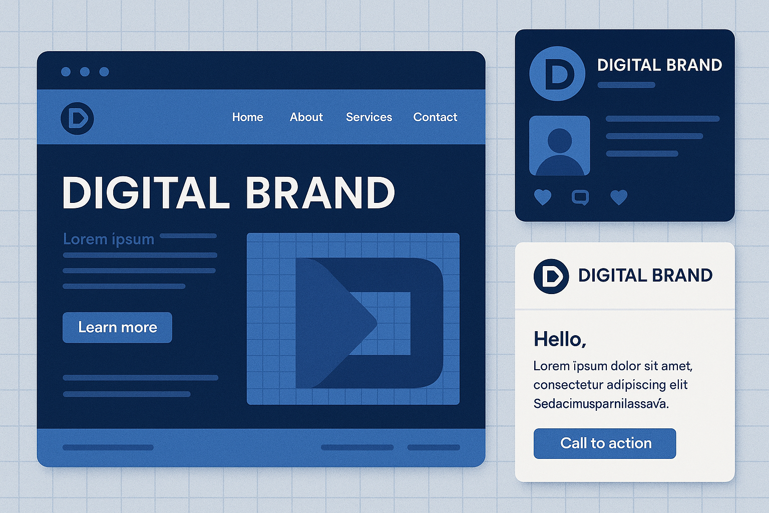
The homepage is the first digital handshake with prospects. Replace the hero banner with a high‑resolution image of the new packaging, ensuring the banner’s dominant hue matches the updated accent color. Button styles—border radius, hover states, and shadow depth—should be standardized across all calls‑to‑action, and typography must meet WCAG AA contrast ratios for readability.
Refresh Social Media Profiles
LinkedIn, Instagram, and Facebook each have unique image dimensions, but the visual DNA stays the same. Upload the new logo as the profile picture and swap the cover images for the refreshed packaging shot. Keep the accent color in story highlights, post borders, or background gradients so followers instantly recognize the brand, even on a quick scroll.
Design an Email Template Library
Emails are a regulated channel, so a modular template library reduces risk and speeds rollout. Each template should start with a header that houses the refreshed logo, followed by a footer that includes the mandatory FDA disclaimer and unsubscribe link. Content blocks—hero image, two‑column product showcase, and CTA button—must pull colors from the dashboard and use the approved typefaces to maintain visual harmony.
Implement a Comprehensive Style Guide PDF
Compile all the visual rules into a downloadable PDF. The guide should feature a one‑page cheat sheet for quick reference, detailed usage examples for logo placement, color contrast tables, and code snippets for web developers. Distribute the PDF to internal teams, third‑party agencies, and any freelance contributors to guarantee that every new asset aligns with the refreshed DNA.
Test for Mobile Responsiveness and ADA Compliance
Before publishing, run each digital asset through responsive design checks on common devices—from iPhone SE to 15‑inch laptops. Use automated tools like Lighthouse to verify that color contrast, alt‑text, and focus order meet ADA standards. Document any issues in a shared spreadsheet and assign remediation tasks to the appropriate team members.
- Dashboard launch: Centralize logos, colors, fonts, and icons.
- Homepage refresh: New hero banner, uniform button styles, accessible typography.
- Social media update: Consistent cover images and profile pictures across platforms.
- Email library: Modular blocks, regulatory footer, brand‑aligned palette.
- Style guide PDF: One‑stop reference for internal and external stakeholders.
- Compliance testing: Mobile responsiveness and ADA validation before go‑live.
By treating every digital asset as a piece of the same puzzle, YPB preserves brand recognition while showcasing the fresh visual identity. The result is a seamless experience that reinforces trust, drives engagement, and keeps the brand’s core DNA unmistakably visible across every online interaction.
Communicate the Refresh to Stakeholders
Internal launch: equip your team first
Before any external eyes see the new visual identity, YPB should host a concise training session for sales representatives and clinic‑support staff. The agenda must cover the updated logo, color palette, and typography, as well as a set of approved talking points that emphasize continuity of product quality and regulatory compliance. Role‑playing common customer questions during this session helps staff internalize the narrative, ensuring every interaction reinforces confidence in the brand’s unchanged scientific foundation.
External announcement timeline: staged and strategic
A staggered rollout keeps anticipation high while giving each communication channel room to breathe. Begin with teaser posts on social media and in the YPB newsletter two weeks before the official change, hinting at a “new look for a trusted partner.” Follow the teaser with a formal press release that outlines the visual refresh, the rationale behind it, and a reaffirmation that product composition and RUO status remain identical. Finally, publish a detailed “What’s New” blog post on the YPB website that links to the press release, showcases side‑by‑side visual comparisons, and provides a clear call to explore the updated brand assets.
Downloadable brand transition kit
To streamline adoption, make a brand transition kit available in a secure portal. The kit should contain updated PDF templates for marketing collateral, high‑resolution label files ready for on‑demand printing, and a concise FAQ that answers the most common stakeholder concerns. Including a version‑controlled style guide ensures that any third‑party agencies or internal designers can produce compliant materials without guesswork, preserving the visual DNA while reflecting the refreshed aesthetic.
Compliance messaging: reassure without overpromising
Every external touchpoint must contain a compliance banner that explicitly states the product’s composition, potency, and Research Use Only (RUO) designation have not changed. Pair this banner with a brief regulatory note that cites YPB’s adherence to FDA guidelines and its commitment to ethical peptide distribution. By foregrounding this reassurance, you protect both the brand’s credibility and the clinic’s confidence in continuing to use YPB products for research and formulation development.
Feedback loop and collateral optimization
After the public launch, distribute a short, anonymous survey to internal teams, existing customers, and key regulatory partners. Ask participants to rate brand recognizability, perceived trustworthiness, and any visual elements that may cause confusion. Analyze the results within a week and prioritize adjustments to high‑impact marketing collateral—such as brochures, trade‑show displays, and digital ads—before committing to full‑scale production. This iterative approach demonstrates responsiveness, mitigates risk of misrecognition, and ensures the refreshed brand resonates across every stakeholder group.
Keep Your Brand Fresh and Compliant with YPB
To refresh a peptide brand without eroding the trust you’ve built, follow the six‑step framework we’ve outlined throughout this guide:
- Assess market positioning and growth goals.
- Audit DNA – identify the visual and messaging elements that define your brand’s identity.
- Redesign packaging to reflect updated aesthetics while preserving recognisable cues.
- Sync digital assets – website, social channels, and e‑commerce listings must mirror the new look.
- Communicate the change clearly to clinicians, research subjects, and partners.
- Monitor performance metrics and gather feedback for continuous refinement.
Executing each of these steps can feel like a full‑time project, but YPB’s white‑label, turnkey solution removes the heavy lifting. We handle on‑demand label printing, custom packaging, and dropshipping—all with zero minimum order quantities. This means you can launch a refreshed line instantly, without the capital outlay or inventory risk that traditionally stalls rebranding efforts.
Beyond logistics, YPB brings deep expertise in FDA‑compliant Research Use Only (RUO) labeling. Our team stays current with regulatory guidance, ensuring every bottle, label, and shipping document meets strict compliance standards. By partnering with us, clinics and entrepreneurs gain a trusted compliance partner that simplifies market entry, allowing you to focus on research subjects care and business expansion rather than paperwork.
Ready to give your peptide line a fresh look without sacrificing the trust you’ve built? Let YPB handle the design, compliance, and fulfillment so you can concentrate on delivering results and growing your practice. Visit YourPeptideBrand.com to start the conversation and discover how a seamless rebrand can accelerate your brand’s next chapter.