For research use only. Not for human consumption, diagnostic, or therapeutic use.
Why Clean Aesthetics Matter for Peptide Research Brands
The peptide market sits at the intersection of cutting‑edge science and regulated health care. Brands that operate in this niche must project a level of professionalism that reassures clinicians, clinic owners, and wellness entrepreneurs alike. A polished, minimalist website does more than look good—it signals that the company understands the rigor behind research‑use‑only (RUO) peptides and is committed to compliance, safety, and scientific integrity.

Clean design leverages white space, high‑resolution lab imagery, and restrained typography to create a visual language that mirrors a laboratory’s controlled environment. When a visitor sees generous margins and crisp, un‑cluttered graphics, the brain subconsciously equates that order with scientific rigor. In contrast, a crowded homepage filled with stock photos and garish colors can suggest a lack of focus, undermining confidence in the brand’s research credentials.
Psychologically, decision‑makers in health and wellness are wired to seek clarity and reduce risk. A streamlined layout reduces cognitive load, allowing clinicians to locate product specifications, safety data sheets, and compliance statements without distraction. Studies in visual perception show that users spend 20 % less time interpreting information on minimalist pages, which translates into faster trust formation and higher conversion rates for premium peptide products.
A real‑world benchmark is PeptideSciences.com. The site employs a sparse grid, a single hero image that showcases a laboratory bench, and a muted color palette anchored in whites and cool blues. This restraint communicates authority; the site feels like an extension of a research journal rather than a commercial storefront. Visitors leave with the impression that the brand operates under strict scientific standards, a perception that directly supports sales to discerning professionals.
Quick Checklist: Clean Aesthetic Must‑Haves
Use the following checklist as a baseline when designing or auditing your peptide research website:
- Sharp hero image: Feature a high‑resolution photograph of laboratory equipment or a scientist at work to set a scientific tone from the first glance.
- Consistent grid system: Align text, images, and call‑to‑action buttons to a 12‑column grid for visual harmony and predictable navigation.
- Limited color palette: Stick to 2–3 complementary colors—typically a neutral base (white or light gray) plus one accent hue that reflects your brand identity.
- Ample white space: Give each element breathing room; this reduces visual noise and emphasizes key information such as product purity data.
- High‑resolution lab imagery: Replace generic stock photos with authentic shots of your own facilities or partner labs to reinforce credibility.
Implementing these elements doesn’t require a full redesign. Start by auditing your current pages: replace any low‑quality graphics with crisp lab photos, tighten the column layout, and trim unnecessary decorative elements. As you iterate, monitor user behavior—lower bounce rates and longer session durations will signal that the cleaner aesthetic is resonating with your professional audience.
Core Design Elements – Layout, Typography, and Color
Grid Systems & Responsive Breakpoints
Modern research peptide sites must adapt seamlessly from a desktop lab workstation to a clinician’s tablet. A 12‑column grid provides the flexibility to position scientific imagery, product cards, and regulatory notices without crowding the layout. Define breakpoints that align with common device widths: 1440 px for large desktops, 1024 px for tablets in landscape, 768 px for tablets in portrait, and 480 px for smartphones. At each breakpoint, adjust column spans so that primary content—such as a peptide catalog—always occupies a readable width while secondary elements (e.g., navigation, contact info) collapse into a hamburger menu.
- Desktop (≥1440 px): Full‑width hero, 4‑column product grid, generous side margins.
- Tablet landscape (1024 px–1439 px): 3‑column grid, reduced side padding, navigation remains horizontal.
- Tablet portrait (768 px–1023 px): 2‑column grid, stacked hero text, navigation shifts to a compact top bar.
- Mobile (≤767 px): Single‑column flow, collapsible menus, CTA buttons expand to full width.
Typography Hierarchy
Credibility in the peptide space is closely tied to the visual language of scientific journals. Use a serif typeface—such as Merriweather or Georgia—for all headings (H2–H4). The subtle contrast of serifs conveys authority while still looking contemporary when paired with a clean sans‑serif body font like Open Sans or Roboto. Establish a clear hierarchy:
- H2 (section titles): 42 px, bold, line‑height 1.2, uppercase for emphasis.
- H3 (sub‑sections): 32 px, medium weight, line‑height 1.3.
- Body copy: 18 px, regular weight, 1.6 line‑height, max‑width 720 px for optimal reading.
- Captions & footnotes: 14 px, light weight, gray‑scale color for subtlety.
Maintain at least a 1.5 × ratio between heading and body sizes to ensure visual separation, and reserve italics for citations or scientific nomenclature only.
Color Palette Strategy
Cleanliness and trust are communicated through a restrained palette. Anchor the design with a crisp white background (#FFFFFF) and a cool, clinical blue (#0A3D62) for primary navigation, headers, and link accents. Introduce a muted teal (#5A9A8D) as an accent hue; it provides enough contrast for call‑to‑action (CTA) buttons without overwhelming the scientific aesthetic. Use the accent sparingly—typically on CTA backgrounds, hover states, and data visualizations—to draw the eye where conversion matters.
| Purpose | Hex Code | Typical UI Element |
|---|---|---|
| Background | #FFFFFF | Page canvas, content cards |
| Primary | #0A3D62 | Header bar, links, icons |
| Accent | #5A9A8D | CTA button, hover states, charts |
| Text (primary) | #212121 | Body copy, headings |
| Text (secondary) | #555555 | Captions, footnotes |
Visual Hierarchy in the Hero Section
The hero banner sets the tone for credibility and conversion. Position a high‑resolution laboratory photograph that spans the full width of the viewport; this instantly signals a research‑focused environment. Overlay a concise value proposition—no more than eight words—using the serif heading style at 48 px, ensuring it remains legible against the image backdrop. Directly beneath the proposition, place a prominent CTA button styled with the muted teal accent, sized at 18 px, and padded to a minimum of 14 px vertically. The button should stretch to 80 % of the viewport width on mobile, but sit at a natural width on larger screens.
Whitespace around the hero text is essential; it prevents visual clutter and reinforces the “clean lab” aesthetic. Use a subtle dark overlay (e.g., rgba(0,0,0,0.25)) on the image to improve text contrast without sacrificing the photographic detail.
Mockup Illustration
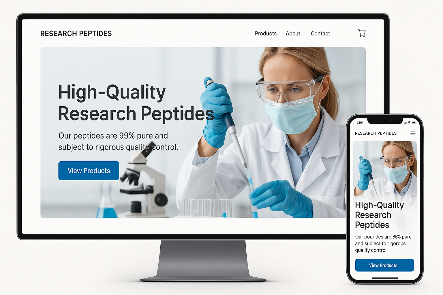
The included mockup visualizes the recommended layout: a fixed top navigation bar in cool blue, the hero section with the lab photo and teal CTA, a three‑column product showcase that collapses gracefully at defined breakpoints, and a footer that mirrors the header’s color scheme while providing regulatory links and contact information. By adhering to this structure, designers can deliver a site that feels both scientifically rigorous and user‑friendly, encouraging clinicians to explore product details and ultimately trust YPB’s white‑label solutions.
Building Credibility Through Trust Signals and Scientific Content
Strategic Placement of Trust Badges
Visitors form an instant judgment about legitimacy the moment they see visual cues. Position the FDA disclaimer badge, peer‑reviewed journal icons, and the secure lock symbol together in the lower‑right corner of every product page and in the global footer. This “trust cluster” stays visible without overwhelming the main content, reinforcing compliance the moment a user scrolls toward a purchase decision.
- FDA disclaimer badge: Use a concise “Research Use Only – Not for Human Consumption” graphic that matches the FDA’s color palette.
- Peer‑reviewed journal icons: Small, recognizable logos of journals such as Nature, J. Med. Chem., or Peptide Science placed next to each peptide name.
- Secure lock symbol: The standard padlock icon tied to an HTTPS indicator, linked to a brief “Why SSL matters” page.
Footnote Citations that Link to Peer‑Reviewed Sources
Every scientific claim—whether it references peptide stability, receptor affinity, or synthesis purity—should be backed by a short, citation‑style footnote. Format the footnote as a superscript number that opens a new tab to the PubMed entry or journal DOI. Example:
“Peptide X demonstrates a 2.3‑fold increase in β‑cell proliferation1.”
Maintain a clean reference list at the bottom of each page, using a simple ordered list. This approach satisfies both the inquisitive researcher and the regulator who expects transparent sourcing.
Creating a Dedicated “Science Hub”
The Science Hub acts as a centralized library where clinicians can download primary literature, view concise study abstracts, and watch 60‑second explainer videos. Design the hub with three clear tabs:
- PDF Library: Offer downloadable full‑text articles and white‑papers, each labeled with the publication year and journal impact factor.
- Abstract Summaries: Provide a 150‑word lay‑summary that translates complex methodology into actionable insight, always ending with the “Research Use Only” disclaimer.
- Video Snippets: Host short, captioned videos that walk through peptide synthesis steps or highlight key assay results. Embed a “Play” button that triggers a modal window, keeping the page layout uncluttered.
Link the hub from the main navigation and from each product detail page with anchor text such as “Explore the science behind this peptide.”
Designing a Balanced Trust‑Badge Collage
A visual collage of trust badges demonstrates credibility without crowding the interface. Arrange the badges in a single horizontal row, using equal spacing and a subtle gray background to separate them from surrounding copy. Limit the total width to 80 % of the container, ensuring the collage remains responsive on mobile devices.
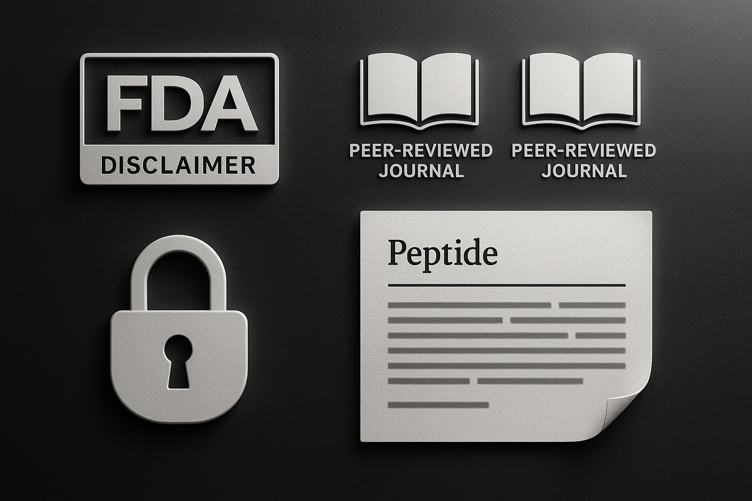
When adding new badges—e.g., a new ISO certification—replace the oldest icon rather than expanding the row. This keeps the visual hierarchy intact and prevents the “badge overload” syndrome that can erode trust.
Compliance‑First Copy Guidelines
Even the most polished design falters without compliant language. Follow these hard‑won rules:
- Never use therapeutic language such as “treats,” “cures,” or “prevents.”
- Consistently prepend every product name with “Research Use Only (RUO).”
- Include the phrase “For laboratory research purposes only” in product headers and in the footer disclaimer.
- Audit all copy quarterly with a compliance checklist that flags prohibited terms, missing footnotes, or outdated badge images.
By weaving trust signals, verifiable citations, and a well‑structured Science Hub into the site’s DNA, YourPeptideBrand positions itself as a transparent, scientifically grounded partner—exactly the reputation that discerning clinicians and savvy entrepreneurs demand.
Optimizing the B2B Ordering Journey and User Experience
The B2B ordering funnel for clinics and entrepreneurs at YourPeptideBrand (YPB) follows four clear stages: catalog browsing, custom packaging, checkout, and the dropshipping dashboard. Each stage must feel like a natural extension of the previous one, eliminating dead‑ends and reducing the number of clicks required to place an order. When the flow is intuitive, conversion rates rise, repeat purchases increase, and the brand’s credibility is reinforced.
1. Catalog Browsing – A Searchable Product Grid
A searchable, filter‑rich product grid is the gateway to the ordering journey. Implement a persistent search bar at the top of the grid and enable column‑based filters (peptide class, purity, price tier). Use lazy loading for images so the page remains fast, even with hundreds of SKUs. Pastel accent colors—soft blues or muted greens—highlight active filters without overwhelming the user, while clear, vector‑based icons (magnifying glass, filter funnel) guide attention.
2. Custom Packaging – Configurable Packaging Modal
After selecting a peptide, a modal window should appear, allowing users to choose vial size, label design, and packaging quantity. Keep the modal single‑column and use progressive disclosure: show only the most common options first, then expand with an “Advanced Settings” toggle. Hover effects on each option (subtle scaling or color shift) provide micro‑interaction feedback, confirming the user’s selection without a full page reload.
3. Checkout – Single‑Page, Autofill‑Enabled Form
The checkout experience must be a single, scrollable page that pulls data from the user’s profile. Autofill fields for billing address, tax ID, and shipping details cut friction for repeat buyers. Incorporate a real‑time validation check that turns the border of an input field green when the entry is correct and red when it isn’t, using soft pastel tones to maintain visual harmony. A sticky progress bar at the top of the page shows “Step 1 → 2 → 3,” reinforcing confidence that the process is moving forward.
4. Dropshipping Dashboard – Real‑Time Order Tracking
Once the order is placed, the dropshipping dashboard becomes the central hub for order status, inventory levels, and shipment tracking. Design the dashboard with a clean card layout; each card represents an order and displays a miniature progress bar, expected delivery date, and a “View Details” button. Real‑time updates (e.g., “Package dispatched”) appear as subtle toast notifications that fade after a few seconds, keeping the user informed without interrupting their workflow.
Visualizing the End‑to‑End Flow
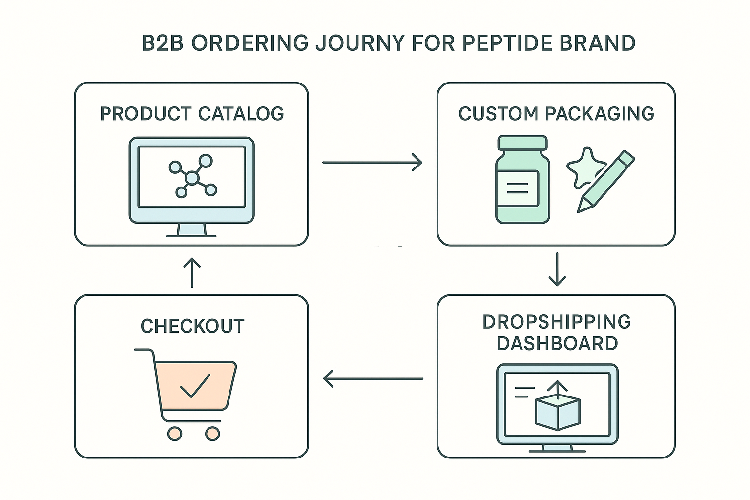
The diagram above maps every touchpoint, making it easy for product managers to spot where micro‑interactions—hover highlights, animated progress bars, and toast alerts—add perceived speed and reliability. When users see a visual roadmap, they anticipate each step, which reduces anxiety and encourages completion.
Accessibility as a Non‑Negotiable
Professional users expect a site that works as well with a keyboard as it does with a mouse. Ensure all interactive elements (search bar, filter chips, modal controls, checkout buttons) are reachable via Tab order and provide visible focus states using a 2‑pixel outline in a contrasting pastel hue. Apply ARIA labels to icons and custom controls so screen readers convey purpose (“Search products,” “Open packaging options”). Finally, test color contrast ratios against WCAG AA standards; pastel accents are fine as long as text remains legible against the background.
Launch Checklist, SEO Basics, and Next Steps
Quick launch checklist
Before you hit “publish,” run through this concise list to ensure a smooth, professional rollout:
- Domain & SSL: Secure a memorable domain and enable HTTPS for every page.
- Hero image: Feature a high‑resolution, compliant visual that instantly conveys scientific credibility.
- Trust badges: Add FDA‑compliance statements, peer‑reviewed research icons, and secure‑payment seals.
- Product pages: Populate each peptide with clear descriptions, molecular data, and usage limits (R‑U‑O only).
- Ordering flow: Test the cart, checkout, and order‑confirmation emails for friction‑free completion.
- Mobile testing: Verify responsive layouts, tap targets, and load times on iOS and Android devices.
Basic SEO tactics
Even a perfectly designed site won’t attract traffic without foundational SEO. Focus on these three pillars:
- Keyword research: Target phrases such as “research peptide brand,” “white‑label peptide packaging,” and “clinical peptide dropshipping.” Use tools like Google Keyword Planner or Ahrefs to gauge search volume and competition.
- Meta‑title & meta‑description optimization: Keep titles under 60 characters and descriptions under 160 characters. Example meta‑title: White‑Label Research Peptide Solutions – YourPeptideBrand. Example meta‑description: Launch a compliant peptide brand with on‑demand label printing, custom packaging, and dropshipping—no MOQs required.
- Schema markup: Implement
ProductandArticleschema to surface rich snippets in search results. Include properties likebrand,sku,price, andauthorfor research articles.
Analytics setup
Data‑driven decisions start with proper tracking. Integrate the following:
- Google Tag Manager (GTM): Deploy GTM once, then add tags for pageviews, scroll depth, and custom events without touching code.
- Conversion tracking: Configure goals for CTA clicks—“Schedule Consultation,” “Download Demo,” and “Add to Cart.” Tie these to Google Ads or Facebook campaigns to measure ROI.
- Heat‑map tools (optional): Tools like Hotjar reveal where users linger on product pages, helping you refine copy and button placement.
Why partner with YourPeptideBrand?
Building a research peptide website is technically demanding and heavily regulated. YourPeptideBrand removes the friction by offering a turnkey, white‑label service that includes:
- On‑demand label printing: FDA‑compliant labels generated per order, eliminating inventory risk.
- Custom packaging: Branded vials, tamper‑evident seals, and insulated shipping kits tailored to your visual identity.
- Dropshipping without MOQs: Each order ships directly from our certified facility, so you never need to purchase bulk inventory.
- Regulatory support: Our compliance team reviews product pages, ensuring all claims remain within R‑U‑O guidelines.
By leveraging our infrastructure, you can focus on research subjects care or clinic growth while we handle the back‑end logistics.
Next steps
Ready to transform your concept into a live, compliant website? Take the following actions:
- Download the Launch Checklist PDF and audit your current build.
- Schedule a free design consultation with our senior web architect. Book now to discuss branding, packaging, and SEO strategy.
- Explore our demo site to see a fully functional peptide brand in action. View demo.
When you’re prepared to move from prototype to production, Visit YourPeptideBrand.com and let our experts guide you through a compliant, revenue‑generating launch.